
Storytelling with Data: Let’s Practice

In Storytelling with Data Part 1, we discussed the six components of effective storytelling, and covered the physiological response an audience will have when connected to the narrative. Let’s try our hand in applying the practical skills of visual creation to complement our stories.
First, here is a quick explanation of how the brain visually perceives stimuli.
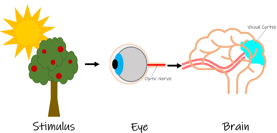
Light refracts off a stimulus that the eye will capture. This image travels through the optic nerve that attaches the eye to the brain. It is the brain that will perform visual processing and make sense of the object. The brain’s visual cortex then creates the image of the stimuli as the visual you perceive. After the image is processed, the brain has access to the iconic memory, short-term memory, and long-term memory storage systems.
The iconic memory is an important form of memory storage that dates back a few notches on our evolutionary chain. It allowed us to quickly perceive changes in our environment, such as the movement of an approaching predator, or anything that will signal our survival instincts to kick in. Humans have thankfully solidified our place as the apex predator yet we still retain the iconic memory. The iconic memory holds information for just fractions of a second before it gets pushed to the short-term memory. It picks up on those preattentive attributes that we talked about in Part 1. You will see shortly why they are very useful tools to leverage in your visualizations.
Color is another important aspect you imperatively have to get right. Color is wonderful, but not to be used for the sake of having color. It is also important to be cognizant of colorblindness when choosing your color scheme. Think of Facebook founder Mark Zuckerberg. He famously chose a blue theme for the Facebook shell because being red/green colorblind, blue is the one color he can consistently see. It is best to choose one color that “pops” for your visuals and then choose some sort of a neutral color such as different tones of grays. This may seem like a bland thing to do, but the reasoning behind it will become more evident in a moment.
Attention Focusing Practice with Real-Life Stills

We will first begin with real-life photographs by playing, “Where do your eyes go?” This will help us get in tune with what draws the eyes’ attention. Then we will make the case against pie charts, explore the process of choosing a data visualization, and finally make the data points pop. Let’s get started!
Take a look at the next photo and see where your eyes go.
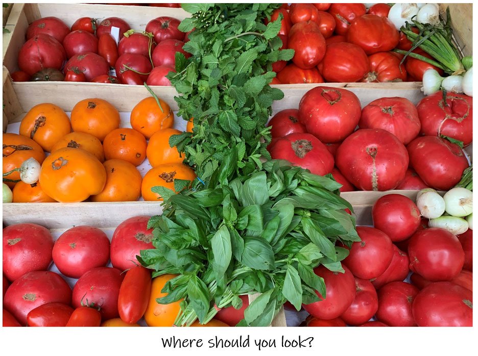
If you have answered you have no idea where your eyes should go, then you are right. Keep in mind that if you do not know where to look, then your audience will have no idea either. There are too many stimuli in this photo. Your eyes will be drawn to the green herbs in the middle because they are different from the red and orange shades you see surrounding it. Green and red, though quite differently toned, are actually complementary colors, and this photo just leaves your eyes darting around without a concrete idea of exactly which area of the visualization you should be focusing on. The same logic will apply when you are presenting your visuals to your audience; you want to make sure you know where their eyes will land to gain the most impact.
Try again with the next photo and pay attention if there is a place your eyes will naturally gravitate to.
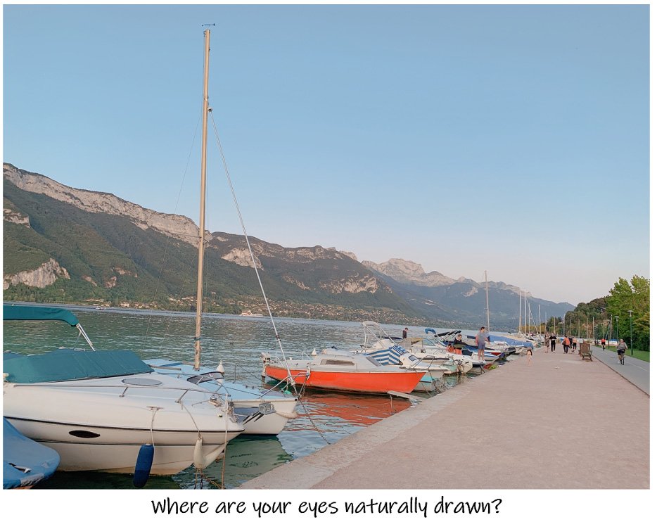
Did you notice how your eyes were immediately drawn to the red boat? This photo is taking full advantage of your iconic memory by landing your eyes on a stimulus in the environment that is noticeably different from its surroundings. Once you have a baseline understanding of how to direct the audience’s eyes, it will be easy to keep their attention exactly where you would like it.
Let us try one last time with photographs. In the following diptych, which one do you think the audience will be able to draw more information from?
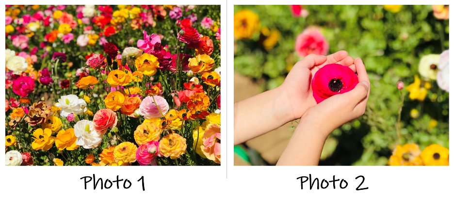
If you answered Photo 2, then you are correct. In Photo 1 the only solid piece of information the audience will be able to decipher is the existence of flowers. It may be possible to identify a few species in the bottom right corner, but as the eyes ascend up the photograph, it becomes increasingly difficult. Photo 1 has taken too many liberties with the color scheme, and it is too overcrowded, leaving the audience’s eyes darting around meaninglessly. In Photo 2, even though it is a simpler picture, it is much easier to subconsciously pull information from it. Here you can look at this photo and say, “Okay, this is a flower bed. There is a child holding a pink poppy on a relatively sunny day that is most likely sometime around midday due to the shadow length.” Even though the other picture seemingly has more stimuli, it is less informative. The same concept applies to the visualizations you present when you story tell with data. When in doubt, less is more.
Adding Preattentive Attributes to Your Toolkit

Taking the concept of what captures attention in real-life settings, it is time to apply the same concept of how to use preattentive attributes in a different format. For the next part of this exercise, start with the group of the black numbers on the left. Time yourself and see how quickly you are able to count how many “4’s” there are. Repeat this same exercise with the group of gray and blue numbers.

Notice how much quicker and easier it is to count the blue “4’s.” This is because graying out the other numbers and highlighting the stimuli that the storyteller would like you to see in blue used your brain’s built-in preattentive tool kit. This is a valuable skill and an effective way to have your audience focus their attention exactly where you would like it to be before they even realize what they are seeing.
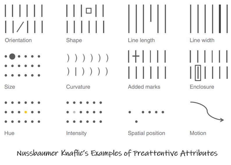
Hue is not the only preattentive attribute available that will stimulate the iconic memory. Below is author of Storytelling with Data’s Cole Nussbaumer Knaflic’s chart for reference.
How Pie Charts Add Zero Value

Next, it is pertinent to make the case against the pie charts. Let us pretend Figure 1. is showing very important digital marketing trends over the past three quarters. Presumably, you are trying to convince your company that trends “D” and “E” you were requested to invest the majority of your time working on during Q1 does not appear they will have the continuing upward trend as initially expected in Q4. Just by looking at Figure 1, would you agree?
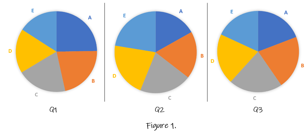
Of course, by looking at those three pies, it is impossible to know whether you would agree or not. Besides the color scheme being an affront to the eyes, it is impossible to decipher any of the information presented. Please keep in mind, this color scheme was chosen solely to make a point. The human brain just is not capable of making sense of the angles and even less capable of comparing the angles from one pie chart to another. Take a look at Figure 2, and just with an initial glance, you can see that you would agree with yourself in regard to trends “D” and “E” and there is also a story to be told here that you would have otherwise missed with the pie charts.
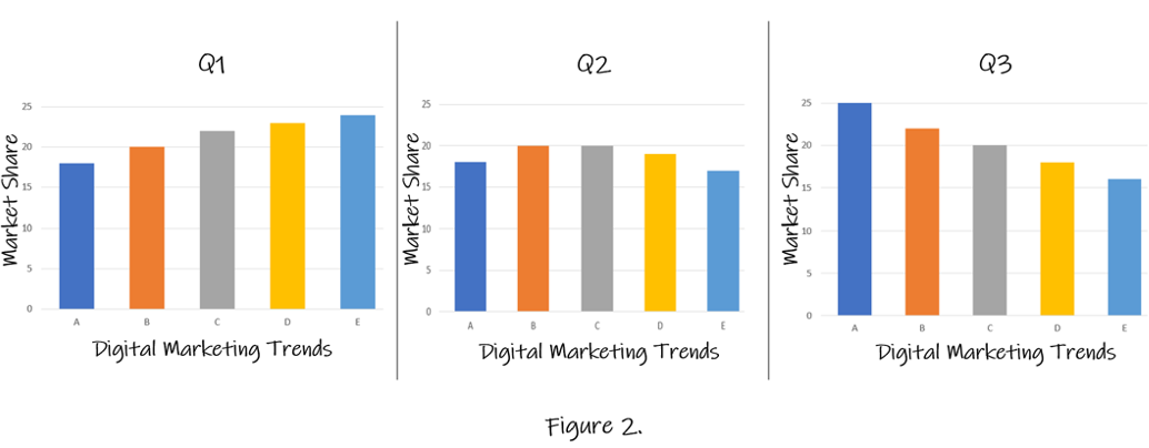
The brain interprets shorter lengths as meaning “less” and longer lengths as “more.” This is why using pretty much anything besides a pie chart is much more effective in storytelling. Here, the brain will naturally interpret the bar chart, and as witnessed in Figure 2, will be able to extrapolate valuable insights with minimal prompting.
Let’s Give it a Try!

Can we try another example using the table below?
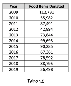
To provide some backstory, we can pretend this is a simple spreadsheet from a grocery store chain showing their donations of food items to the food pantries that were past “best-by” dates. It is in the interest of the grocery store to ensure they are donating as many food items as possible that are no longer profitable because they can be used for a tax write-off at the end of the year. Of course, it also benefits local charities and their patrons, so it is a win-win for everyone. Your job is to look into why this grocery store chain has had such crippling taxes in 2018 and 2019 and present your findings. Digging into your data, you notice inequities in the number of donations from the previous two years. What are a few simple and effective ways to visualize this table?
How might you personally begin to make sense of the data? What are some ways you think would be effective in visualizing the data we have in this table? Sometimes it is best to provide yourself with a few different methods of visualization. Afterward, look away for a moment, and when you look back, choose what pops out the most to your eyes. Should we start by trying to get a feel of the data by using a heatmap?
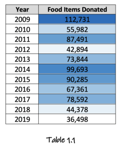
Right away, courtesy of the heat map leveraging your iconic memory, your eyes immediately jump to the brightest cells. You can see immediately 2018 and 2019, our years of interest have low donations. Also, please note when presenting a table to your audience, you run the risk of them tuning out what you are saying to instead read the table they are presented. However, do not be deterred from doing visualizations such as heatmaps for yourself as they will help you as a whole to see the data from different angles, which will, in turn, aid you with your storytelling.
Next, it would be valuable to try a few more charts and see which conveys your story best. Of the following two charts, which do you prefer?

Line graph, right? For this particular instance, it is easier to interpret the data by seeing its linear relationship, which the scatterplot is not capable of delivering. Just by creating these charts you can start seeing which one is communicating the story most effectively. Shall we try again? The correct answer is yes, always try again.
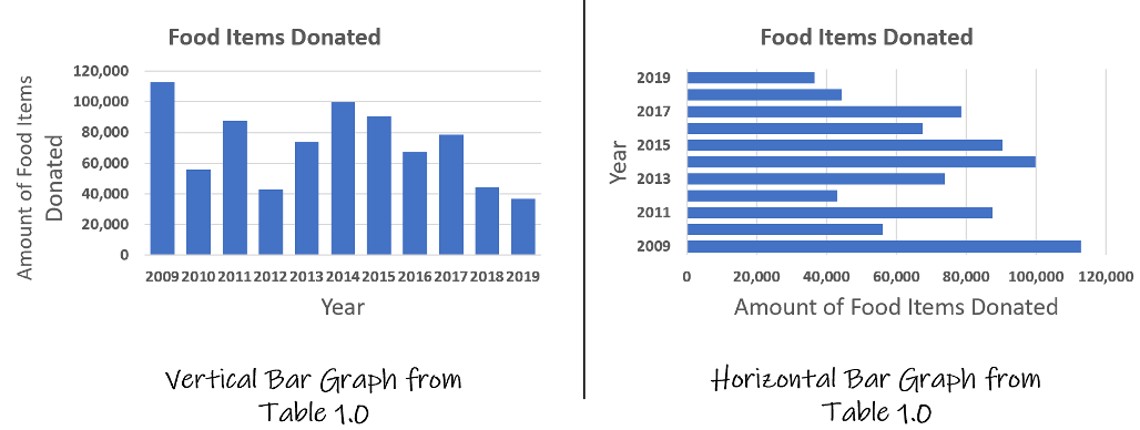
This is where it starts to become subjective. As the brain translates length as the amount, for this particular scenario, using a form of bar chart would be most appropriate for our particular scenario. The vertical graph is arguably easier to read for those who are accustomed to reading left-to-right because it can easily be extrapolated at the far right of the graph (the most current years) donations were down. The horizontal graph does present this information but in a bit more of a convoluted way.
Once you have figured out which visual speaks best to the data and your story, highlight the data points that you would like the attention focused on to make them “pop.” In this case, it would be the years 2018-2019. Here you can direct all the attention from the rest of the graph and focus specifically on these two years to explain the reason why the company taxes have been so high as their write-offs have been less those two years.

Let’s Try One More Time with a Bigger Dataset

Sometimes there is just too much data to fit neatly into a bar graph. This is especially common with timeseries data, where plotting too many data points in a bar graph will result in a stimuli overload. Another option is to use a line graph to minimize the number of stimuli in your visual. Take a look at Table 2.0., which is a hypothetical dataset that represents a startup company’s sales in the U.S. and Canada. To be profitable both countries must reach a monthly goal of 325 sales. Canada has not been doing great, and this startup is on the verge of pulling out of the Canadian Market. Your job is to visualize how the Canadian sales compare to the U.S. sales and expose Canada’s track record for meeting the monthly goal.

As you can see, there are data points in this dataset that span the course of two years, which on a bar graph would equate to 24 bars. Therefore, a bar graph as you can imagine is not a feasible option due to the overcrowding 24 bars would produce.
Please note that it is okay to play around with different visualization methods. Even if you have spent quality time on the current visualization do not be afraid to change tactics. It will pay off in the end. Promise. Let’s try a line graph to get a baseline of what the visual will look like.
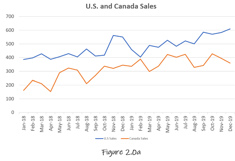
Figure 2.0a is very typical of the type of line graph that will be spit back out at you when clicking the “Create Line Graph” option in Excel. We can all agree this is not great, right? Do not despair, this is a solid start. Next, it is a good idea to make a list of everything you hate, would like to change, add, or emphasize. So here it goes:
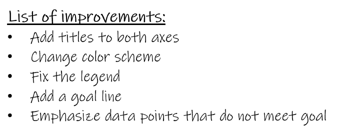
This is a tentative list, so it is okay to cross ideas out and make changes. The worst thing you can do is get stuck on one idea and invest so much time on it that you become too attached, and it is too painful to change. Give yourself permission to erase everything and start again if you are not happy. It is okay!
Let us go back to our tried and true color scheme of blue and gray, implement our list of changes, and take a look.
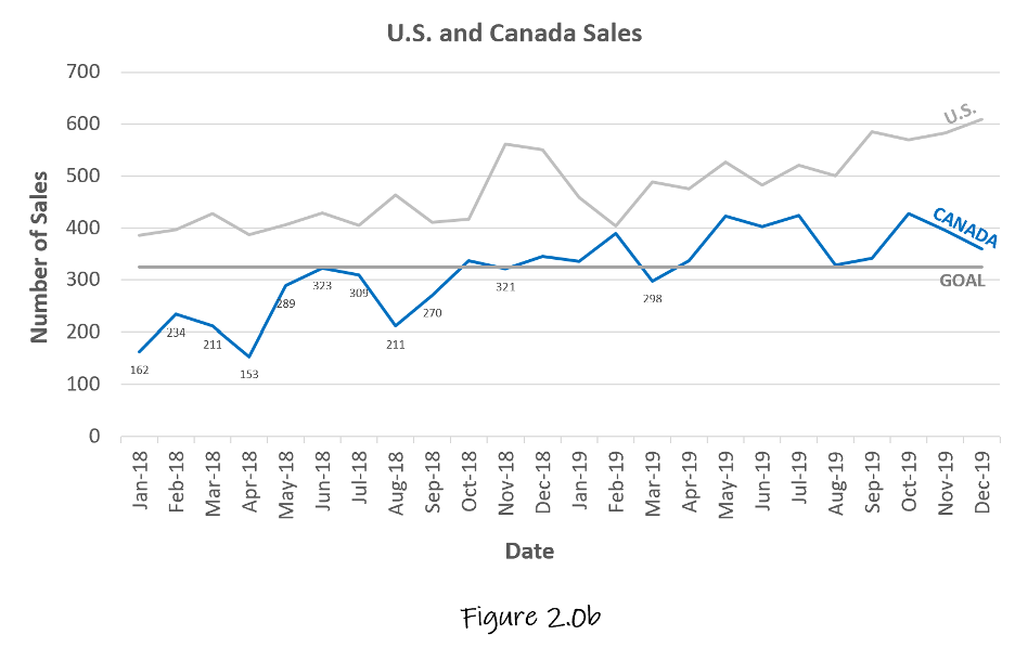
The U.S. line was changed to gray because we want to put the main emphasis on how Canada is performing. The added “Goal” line provides a nice effect of letting the brain visualize where in relation to the goal each country falls every month. However, the goal line is too intense and needs to be fixed to ensure the attention falls on the blue “Canada” line primarily. The legend drew too much attention away from the actual data, so it was deleted. The decision to add the legend labels directly onto each line was executed to keep the focus on the actual data. The last critique for this graph is the data points for the months of the unmet goals look messy and require more emphasis. Our line graph is definitely improving, but not quite there yet.
After being able to physically see our implemented changes, it is time to give it another try with the new ideas.
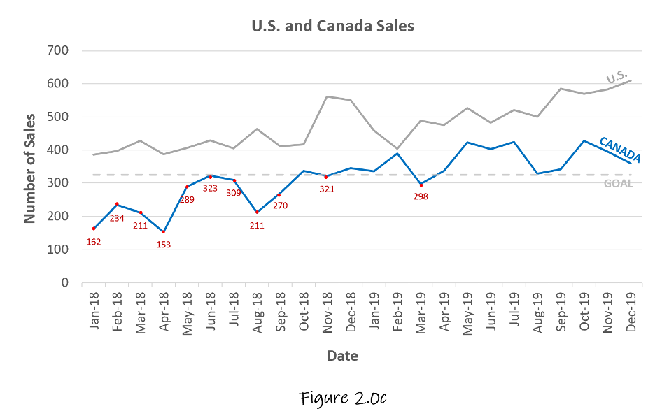
In this finalized version, the iconic memory is being leveraged to quickly count that 11 times out of the possible 24 times Canada did not meet its sale’s goal. The “goal” line has been changed to be less prominent. By doing this, the primary focus is on Canada, secondarily the U.S., and the tertiary focus is the relationship to the goal lines both of these countries have.
Once again, it is okay to iterate through different visualizations until you are satisfied. Just remember to know who your audience is, be succinct, be engaging, enjoy the process, and your story will land.
Storytelling with Data Coursework: USD’s MS-ADS Program

The Harvard Business Review published an article in 2018 asking top Data Scientists what exactly they do. Seemingly everyone knows there is a wide array of skills Data Scientists have such as performing robust analytics, predictive modeling, building machine learning pipelines, and everything in between. Yes, of course, learning these skills is a must when considering enrolling in a Data Science program, but what the Harvard Business Review discovered interviewing the country’s leading Data Scientists is that there was a resounding consensus that effective communication and explaining technical results to a nontechnical audience was the most important skill.
The Master of Science in Applied Data Science (MS-ADS) program at the University of San Diego understands that the best data scientist requires not only a technical skillset but must also be skilled in effective storytelling with data. We understand its importance and implement this valuable skill in the courses of the Master of Applied Data Science online program.